Pain Institute of Arizona
Case Study: Pain Institute of Arizona — Brand Identity & Architecture
Project Overview
Spine Institute of Arizona (SIAZ) sought to establish the Pain Institute of Arizona as a distinct, specialized sub-brand. The core design challenge was to create a standalone visual identity that felt unique to pain management while maintaining a powerful, recognizable visual lineage back to the parent company.
Brand Principles & Strategy
The brand identity development was anchored by four core principles:
Distinct Identity: Establish Pain Institute of Arizona as an independent practice separate from SIAZ.
Endorsed Architecture: Retain a clear connection to the SIAZ practice through endorsement (utilizing the descriptor "A Spine Institute of Arizona Practice").
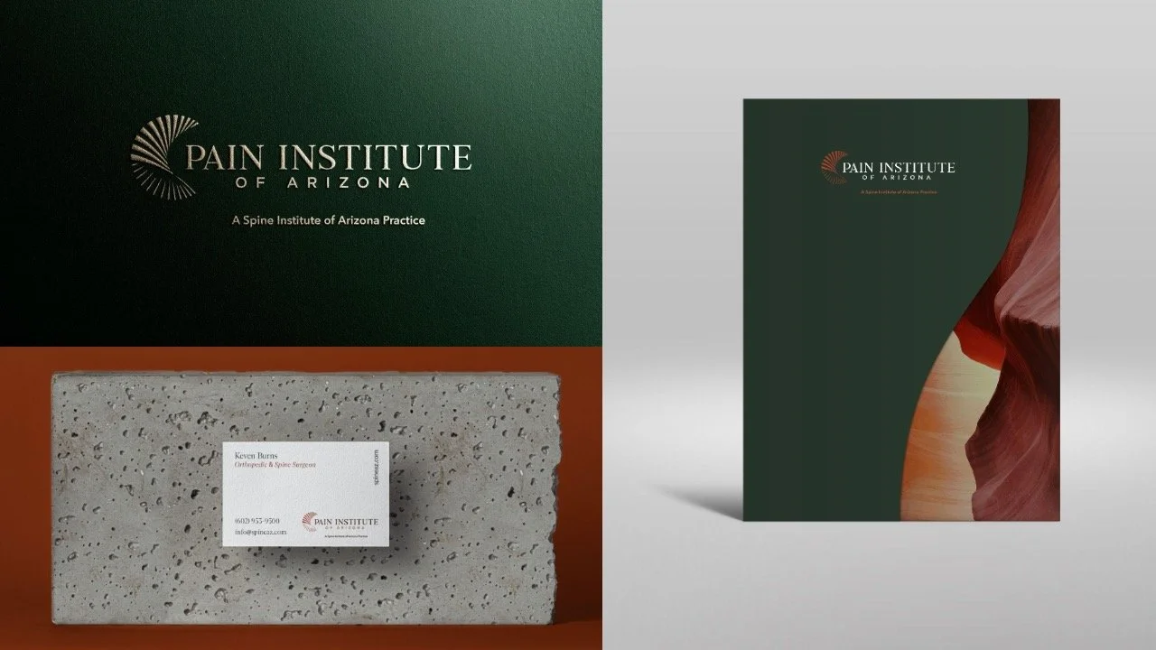
Unified Palette: Utilize a warm Southwest color palette to preserve regional familiarity and continuity with SIAZ.
Scalable System: Build a flexible architectural model that sets parameters for future sub-brands and practices under the umbrella.
The Design Evolution: Translating the Mark
The primary visual challenge was evolving the iconic corporate mark into a specialized spinoff.
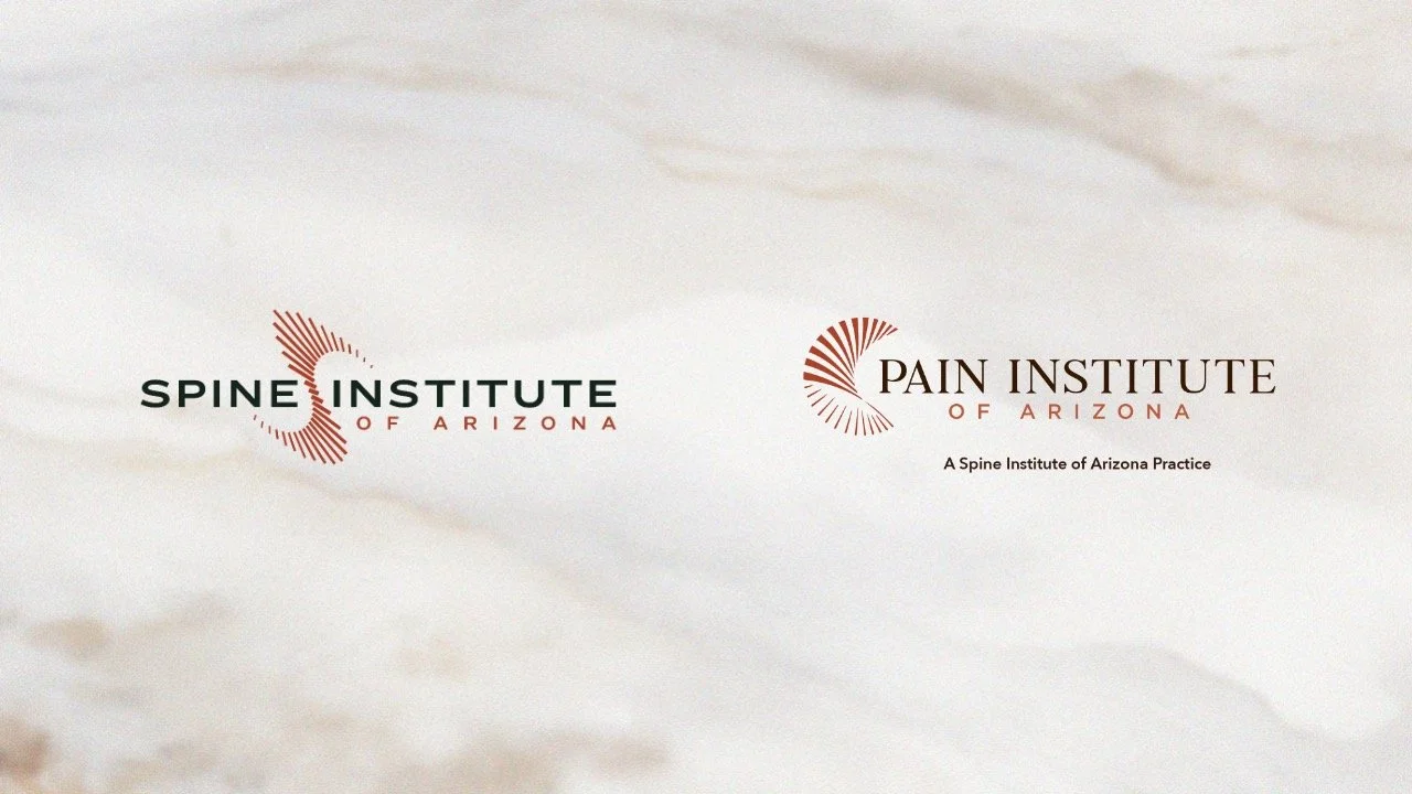
The Parent Mark (SIAZ): Uses a series of sharp, radiating lines symbolizing the spinal column, structural movement, and the interconnected nature of the body.
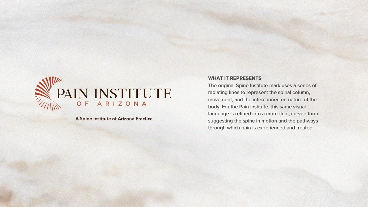
The Spinoff Mark (Pain Institute): Refines this exact visual language into a more fluid, curved form.
The Concept: The dynamic, flowing curves symbolize the spine in motion while subtly representing the physiological pathways through which pain is experienced and treated.
Conclusion
By balancing evolution with continuity, the Pain Institute of Arizona logo functions as a standalone mark that commands its own identity, yet instantly communicates its heritage as a trusted extension of the Spine Institute of Arizona family.